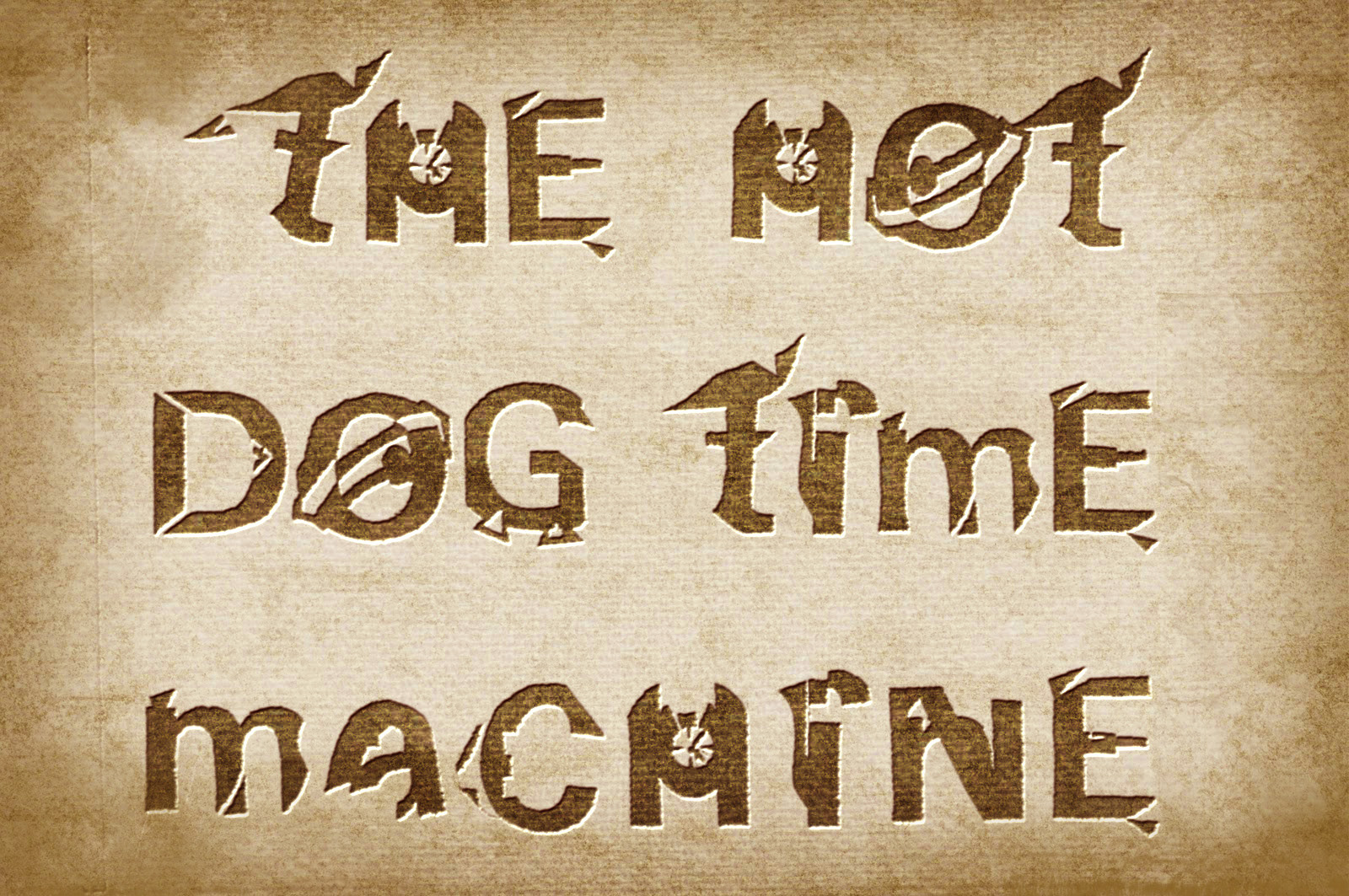
The Hot Dog Time Machine
Title of given brief : Food and location
University project for my BA in Graphic Design for Advertising
Final outcome: A1 double- sided poster which folds into an A3 booklet.
Project Task: Using the lists of foods and different locations, choose one from each and produce an A0 double -sided black and white poster, which sums up your experience eating that type of food in that chosen location. Ultimately the poster needs to be folded up into an A3 booklet, but careful consideration should be given to where the folds fall on the final piece.
My chosen food and location: Eating a hot dog in an urban location (a market diner).
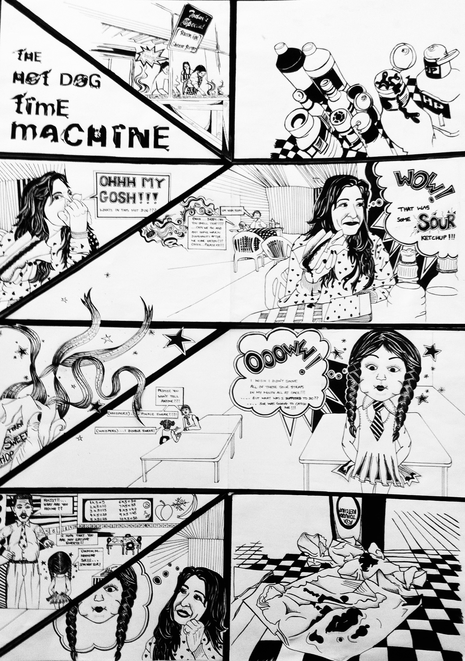
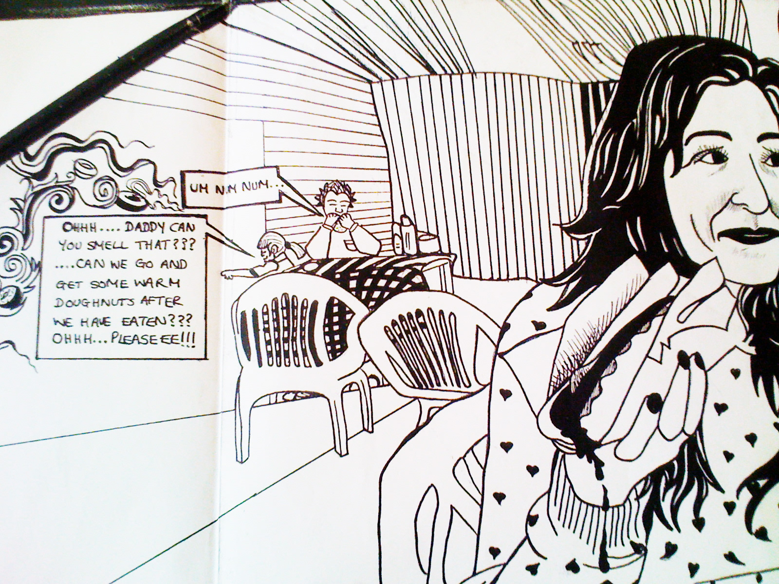
Adding tomato sauce to my hot dog was always like adding the cherry on the top to a brilliant Sunday walk around in our local market. However that particular Sunday was different, taking one bite out of that hot dog was horrible and sour, it tasted as though the tomato sauce had expired a couple of years ago. A range of senses had kicked in by then, and it instantly reminded me of the time when I was 5 years old and had snuck in a sour sweet into the classroom at school. For fear of my teacher catching me, I remember gobbling up all of the sour sweet, the feeling of the tomato sourness brought me back to my days in the classroom. Hence the name of my comic, 'the hot dog time machine'. I decided to create my own type out of existing typography to make this project truly unique. This tomato sauce was like a nostalgic device that took me back in time, an experience definitely worth illustrating.
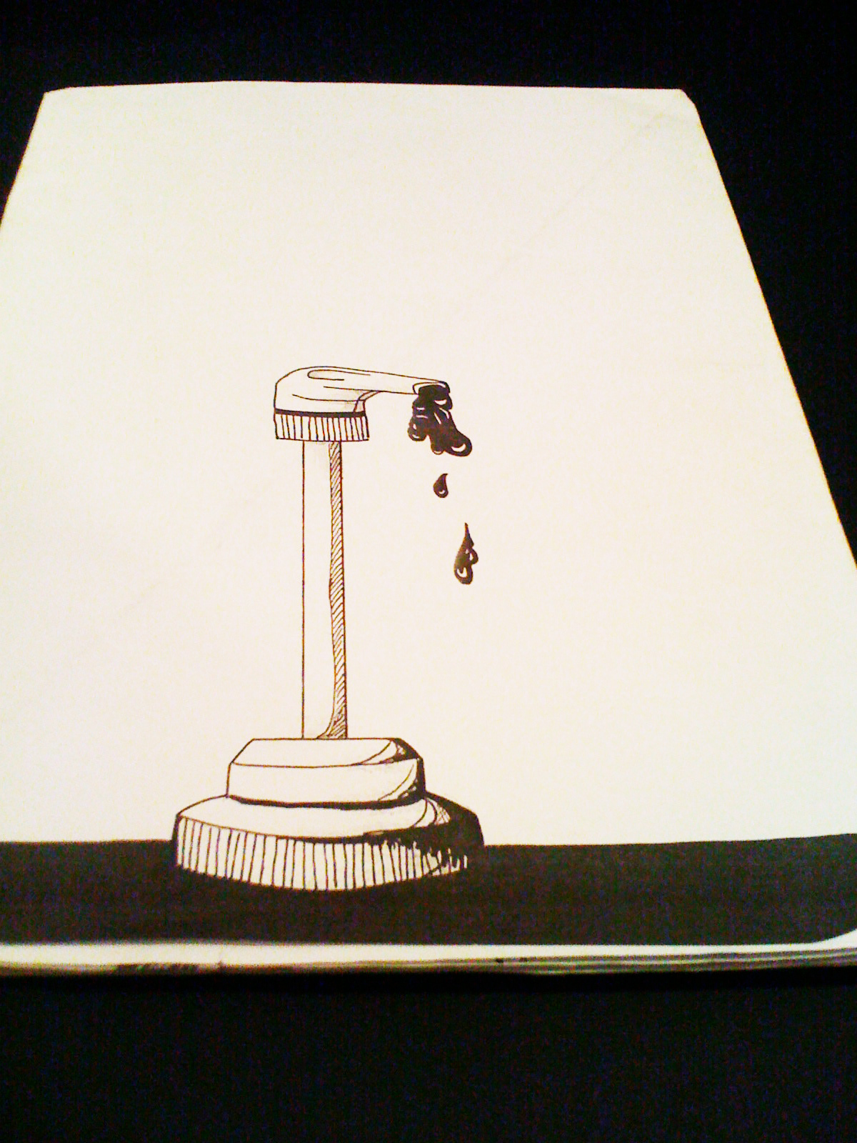
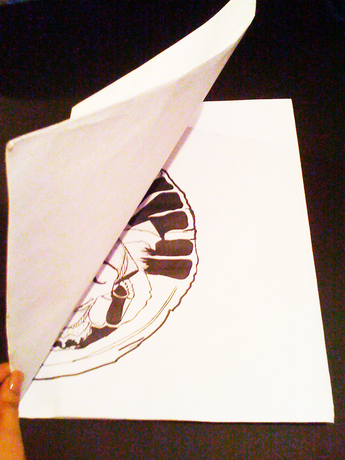
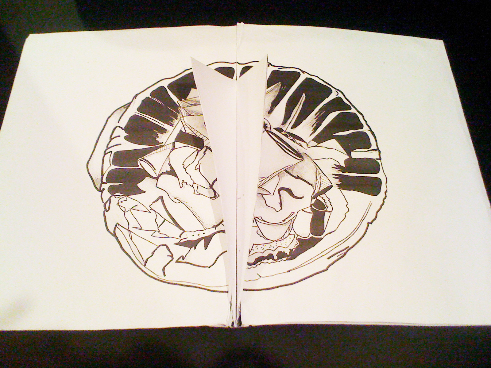
Before even constructing my poster and Illustrations, I thought about the brief and its requirement to pay attention to where the folds fell when being folded into an A3 booklet. When I contemplated the idea of having random folds falling all over my poster, distracting the viewer from the actual content, I then found the perfect solution. The poster should be turned onto a comic and all of the sections created from all the folding could be the scenes to the comic story. The reason why I chose to illustrate with black pens in a comic style was that I wanted to emphasis on the power of the sourness within my story, so a pop art style of illustration commenced. The folding was very carefully considered and evokes an explosion like felling, reminisant of my sour experience. This was going to be an exciting factor for when the audience had to open it and engage. Overall working on this project was a very enjoyable and nostalgic experience!